Contrast Chaser Zero: From Personal Frustration to Product

Disclaimer: Contrast Chaser was developed as part of my U.S. federal government employment. The tool, its development, and associated intellectual property are the property of the U.S. government. This case study describes my role as lead product manager, designer, developer, and user researcher on the project, documenting general product development principles and my professional contributions. No proprietary, classified, or sensitive government information is disclosed. References to adoption and usage reflect the tool's role in supporting government accessibility compliance efforts.
Executive Summary
When new accessibility requirements emerged, they broke my design workflow. Rather than accepting a slower process, I applied product development fundamentals—problem identification, market research, ideation, prototyping, and user validation—to build Contrast Chaser, a tool that measures contrast and provides solutions in a single interface. This case study documents how systematic research and iteration produced the initial minimum viable product (MVP), demonstrating that product thinking applies whether you're building for commercial markets or internal organizational needs.
Problem Identification
Contrast Chaser was born from good intention and personal frustration.
As a senior cartographer specializing in map-based visualizations, I was considered a corporate resource on visual design. When my office began an ad hoc effort to improve accessibility, everything changed. The Web Content Accessibility Guidelines (WCAG) contrast requirements—with their objective measurements—essentially invalidated most of what was considered "good design" at the time.
The existing practice of creating a design, testing it for contrast, then adjusting colors was far too slow to meet production output needs. Traditional tools operated on a pass/fail binary: they measured contrast, told designers they had failed, then left them to figure out solutions on their own.
This experience led to a clear problem statement:
"Accessible contrast testing is too slow."
Effective problem identification requires more than recognizing frustration—it requires articulating a gap between current state and desired state that a product can close. The problem wasn't accessibility itself; it was the friction accessibility introduced into creative workflows.
Market Research and User Needs
Ideating about the needs of visualization producers like myself, I identified two core jobs-to-be-done:
- Measure contrast
- Find a new color that meets contrast requirements when the current color fails
Conducting initial market research through interviews with colleagues facing the same problem validated several personal needs while revealing additional user requirements:
- Preference for familiar interface patterns
- Need to understand why existing colors don't pass
- Desire for actionable alternatives rather than just failure messages
This research phase—informal but structured—distinguished assumptions from validated needs. The insight that users wanted understanding, not just compliance, shaped the product's eventual direction toward education as well as utility.
Prototyping: Research Through Building
Because this was a passion project without immediate commercial goals, formal product roadmap planning with market milestones could be abbreviated. Instead, attention focused on prototyping—the creation of working models to test specific hypotheses.
Several prototypes addressed different aspects of the eventual MVP:
Grey Getter: User Experience Validation
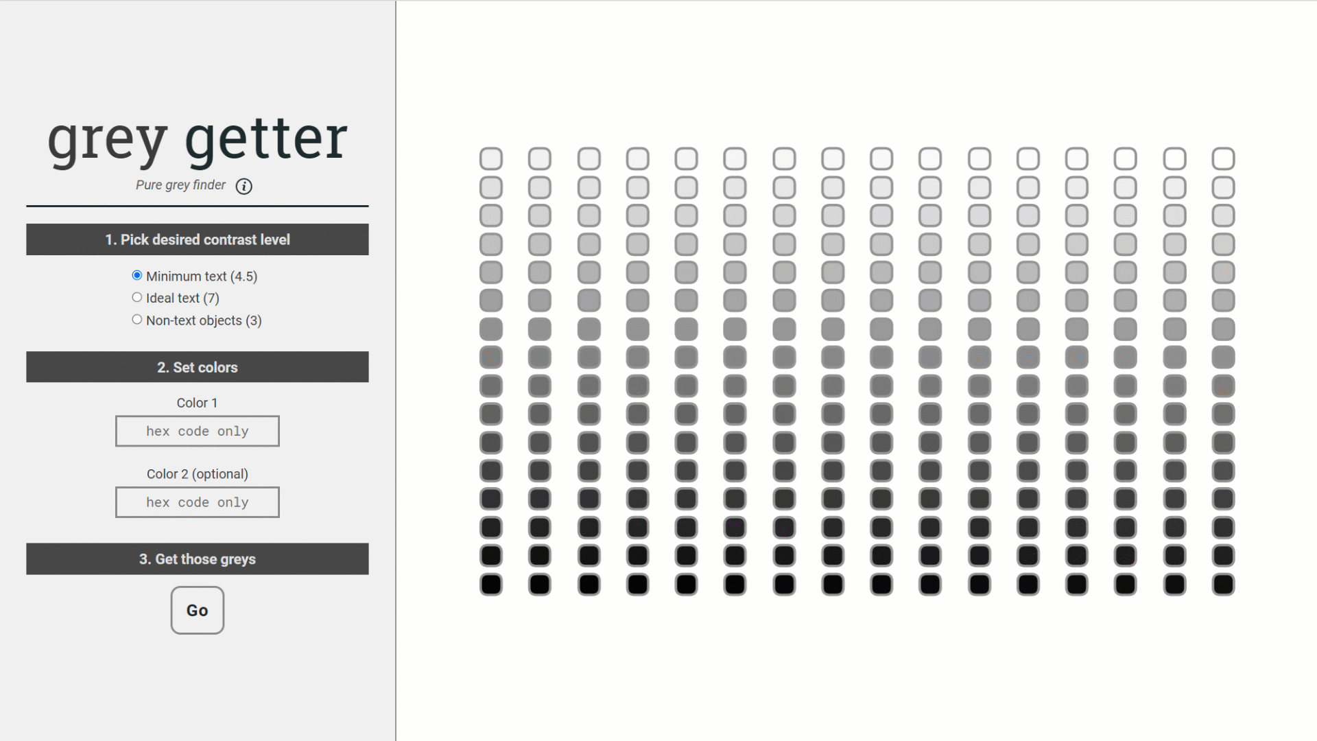
Grey Getter served as a proof of concept validating the core user experience. It established that users could work with an interface allowing color input, contrast ratio selection, and dynamic visualization updates. This prototype answered: Can the basic interaction model work?
Color Blind Color Schemes: Understanding Success Factors
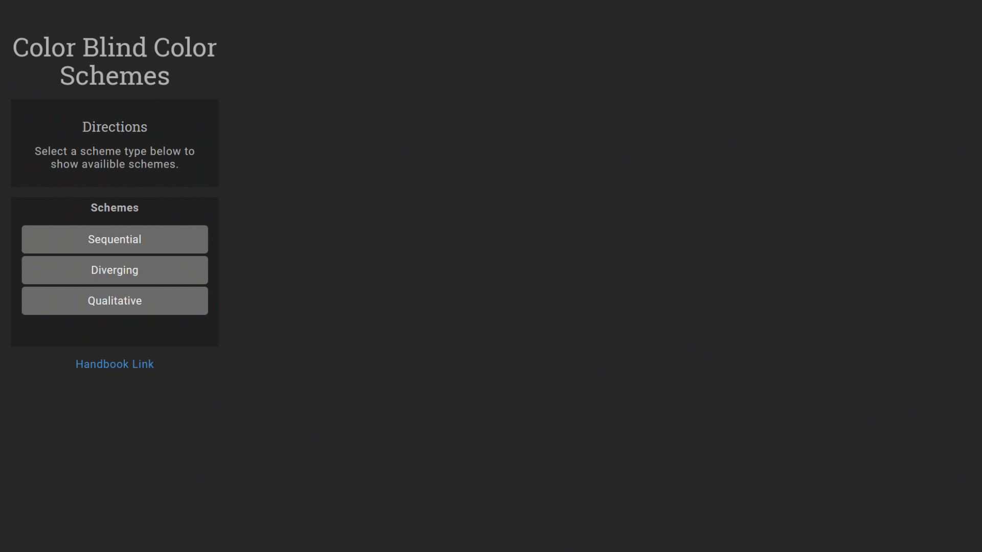
Color Blind Color Schemes explored which aspects of color explained why certain combinations succeed for users with vision disabilities. By visualizing hue, lightness, and saturation together, this prototype generated design insights about accessible color relationships that would inform the algorithm's recommendations.
Color Contrast Trends: Edge Case Identification
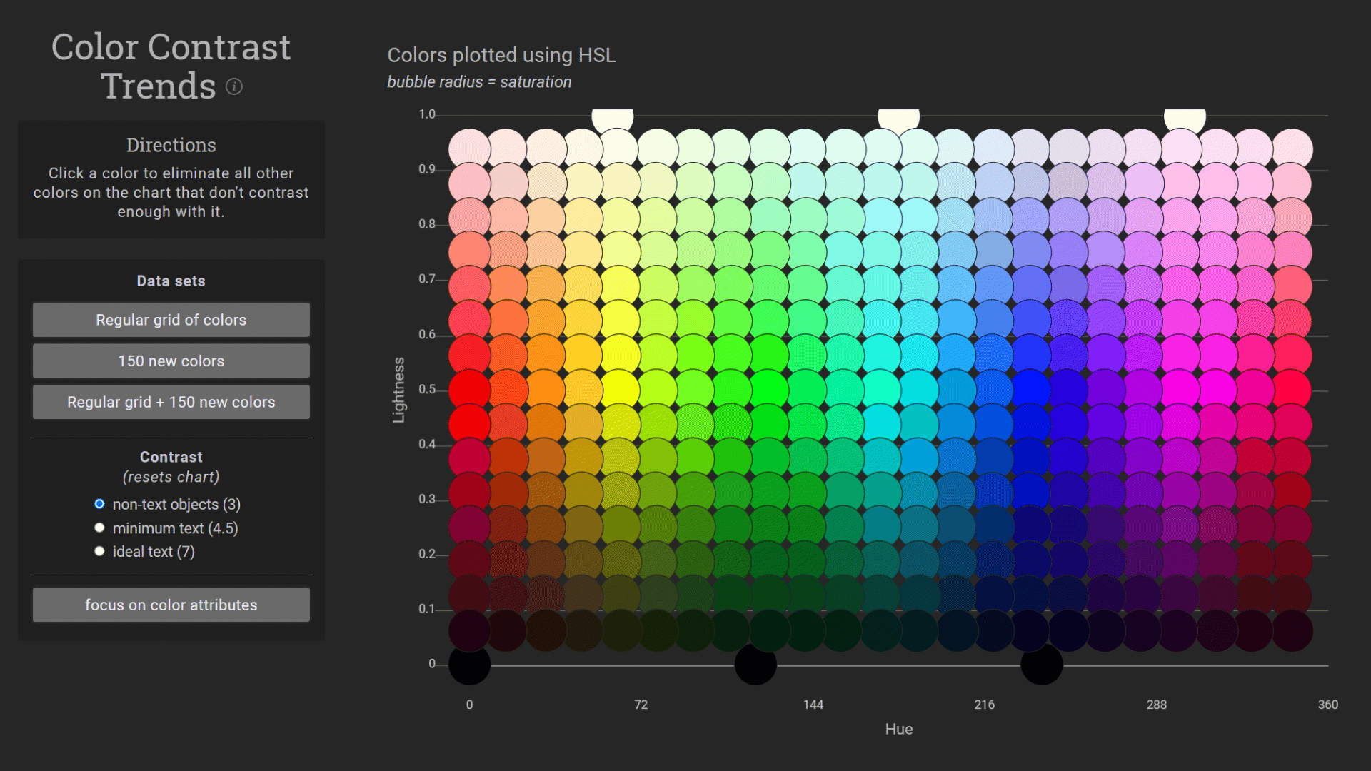
Color Contrast Trends researched color patterns specific to certain contrast ratios. These patterns represented design constraints—limits that any production tool must handle gracefully. Understanding edge cases before building prevents user frustration with unexpected failures.
MVP Development: Synthesis and Release
Combining validated learnings from each prototype, Contrast Chaser's minimum viable product took shape.
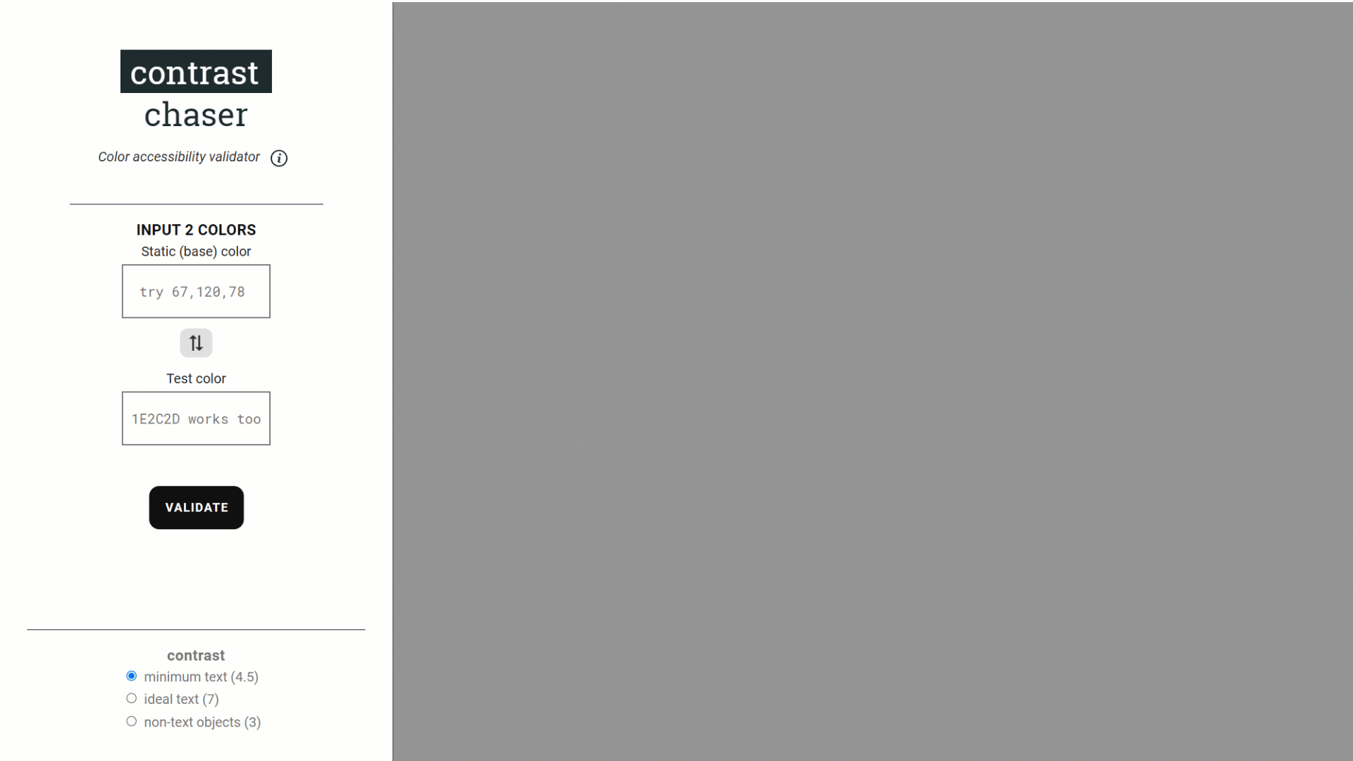
Contrast Chaser Zero synthesized:
- The validated interaction model from Grey Getter
- The color relationship research from Color Blind Color Schemes
- The edge case handling from Color Contrast Trends
The result: an application that measures contrast success while providing users intuitive alternatives to keep their designs moving forward.
This MVP was released to the workforce as a usable beta with explicit expectations: users would test the concept and provide feedback. The goal was learning, not perfection.
User Feedback and Iteration
While all feedback was recorded for later action—representing diverse pain points across the product—one issue dominated:
"It's too hard to input colors into the application!"
The solution was straightforward: an eyedropper feature similar to standard design tools. However, browser support for the EyeDropper API didn't exist yet.
This gap between identified solution and technical feasibility required a two-track response:
- Near-term: User training specific to common workflows provided relief
- Long-term: Anticipatory ideation, research, and planning prepared the eyedropper feature for rapid deployment once browser support arrived
When browsers finally added support, the prepared work paid off. The feature launched in hours rather than weeks. The Monday following a Friday afternoon deployment brought genuine user excitement—validation that the iterative development approach worked.
From MVP to Product
Typical steps following an MVP's graduation into an official product include:
- Sourcing: Identifying suppliers and resources
- Costing: Establishing financial models
- Commercialization: Scaling and revenue generation
In a government context, these steps were reinterpreted:
- Identifying maintenance barriers
- Working within taxpayer-funded IT constraints
- Generating continuing mission impact
The underlying product lifecycle principles remained constant even as their application differed from private industry norms. Products require sustainable infrastructure, understood costs, and clear value propositions regardless of whether revenue or mission defines success.
Outcomes and Organizational Impact
Today Contrast Chaser enjoys wide usage across government, enabling visualization producers to create inclusive media efficiently. The tool has become central to communicating official accessibility policies across multiple agencies.
Beyond the product itself, I now lead an independent Contrast Chaser team that operates with management confidence in autonomous product management. This trust emerged from demonstrated success: initial development that addressed real user needs, consistent user advocacy, and a track record of delivering value.
The project demonstrates that product development methodology applies beyond commercial contexts. Government, nonprofit, and internal tooling all benefit from:
- Systematic problem identification
- User research before building
- Prototyping to validate hypotheses
- MVP releases for rapid learning
- Iterative improvement based on feedback
Lessons in Product Development
Contrast Chaser Zero illustrates several product development principles:
Start with the problem, not the solution. The initial insight wasn't "build a color tool"—it was "accessible contrast testing is too slow." Framing the problem correctly enabled better solutions.
Validate assumptions through research. Interviewing colleagues revealed needs beyond my own assumptions. Users wanted understanding, not just pass/fail verdicts.
Prototype to learn, not to ship. Each prototype tested specific hypotheses. Grey Getter validated interaction models. Color Blind Color Schemes generated algorithmic insights. Color Contrast Trends identified edge cases. None were intended as final products.
Release MVPs for feedback, not applause. Shipping an imperfect but usable beta generated the insight that color input was the primary pain point—something not predicted during development.
Prepare for opportunities. Anticipating browser support for the EyeDropper API meant the feature deployed in hours when the opportunity arrived. Strategic foresight enables tactical speed.
Whether building for commercial markets or internal organizational needs, these fundamentals produce better outcomes than intuition alone.