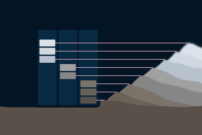
Executive Summary
Candor, my design system, had greys that each passed their contrast audit and, taken together, did not form a system. One ramp held three temperatures, a second cool ramp had two steps, and many greys in use sat at lightnesses no ramp had. Version 6.0 replaces them with three ramps (neutral, cool and warm) that share one lightness scale, so a step number means the same lightness in every ramp and changing temperature barely changes contrast. Chroma in the tinted neutrals comes from one curve, because holding chroma fixed does not hold a colour's identity as it lightens. Temperature now does a job of its own: warm surfaces come forward and cool ones recede. This post covers why the old greys needed rebuilding, how the new ones were built, and what changed for anyone using Candor's design tokens.
How It Started
The prompt was a code block. Candor's code blocks were dark navy panels on a white page, a jump in colour large enough that reading them felt like switching documents. The plan was a faint tint instead, a background only slightly different from the page.
5.x
A paragraph of article text, then the example.
const steps = [25, 100];
const ramp =
  steps.map(toGrey);
6.0
A paragraph of article text, then the example.
const steps = [25, 100];
const ramp =
steps.map(toGrey);Trying tints from each of Candor's brand colours went poorly. Navy came out sky blue and pushed forward. Burgundy, the one warm brand hue, sat close enough to the error red that a code block started to look like it was flagging something. The option I liked best was a warm paper tone, and Candor had nothing like it: every neutral in the system was either pure grey or cool grey.
That raised a broader question than the code block. If the system had no warm neutral, what did its neutrals actually look like as a set?
What the Greys Looked Like
Laid out in one place, the greys were a series of reasonable decisions made one at a time.
- One ramp, three temperatures. The main
--gray-*ramp was neutral through its middle, faintly warm at step 200 (a hue of 17), and cool at 800 and 900, which carried the navy undertone of the dark theme. - A second, two-step cool ramp (
--gray-cool-600and-700) sat beside it for dark surfaces. - Greys in use that were on no ramp at all. Subtle text was
oklch(0.50 0 0), its variant on surfacesoklch(0.44 0 0), control bordersoklch(0.53 0 0)in light mode andoklch(0.62 0 0)in dark, and so on. Each was tuned to clear a contrast floor, and each was correct for that job. - The cool undertone spread across three hues: 245, 248 and 248.99.
The problem was what those values did not give a designer or a developer. A primitive's name did not predict its colour: --gray-800 was cool, --gray-700 next to it was not. Choosing a warmer grey meant choosing a different lightness too, which moved contrast. And a new token had nowhere obvious to land, so the next one would likely become another one-off.
Three Ramps, One Scale
The new greys are three ramps: neutral --gray-*, cool --gray-cool-* (hue 248.99, the navy undertone) and warm --gray-warm-* (hue 69, opposite cool on the hue wheel). All three share the same 14 steps: 0, 25, 100, 200, 300, 400, 500, 550, 600, 650, 700, 800, 850 and 900.
The 6.0 ramps story in Candor's Storybook lays them out side by side, one row per step. A step number means the same lightness in every ramp, so --gray-cool-300 and --gray-warm-300 have the same lightness and differ only in temperature. Moving a surface from cool to warm is now a decision about temperature alone, and its contrast against text barely moves. That independence is also what lets temperature rank surfaces, which a later section covers.
| Neutral | Cool | Warm | |
|---|---|---|---|
| Light800 on 300 | OKCA 6.5WCAG 7.5 | OKCA 6.5WCAG 7.5ΔE 6 | OKCA 6.5WCAG 7.5ΔE 5 |
| Dark200 on 850 | OKCA 10.7WCAG 11.4 | OKCA 10.7WCAG 11.4ΔE 8 | OKCA 10.7WCAG 11.4ΔE 6 |
I spaced the steps unevenly on purpose. Steps 550, 600 and 650 are there because subtle text and borders need those exact lightnesses to clear their contrast floors. Putting the steps where Candor's own tokens needed them is what let every grey semantic token name a step, so none of them is a one-off any more. Pure white belongs to the neutral ramp alone; the tinted ramps start at 25. Of the ten greys that sat between 5.x steps, seven now land on a step at exactly their old lightness; the off-ramp greys story lists each one and the step it uses now.
Chroma From One Curve
OKLCH came with a promise for accessibility. It separates a colour into lightness, chroma (colourfulness) and hue, so a designer can move a colour's lightness until it meets a contrast floor and, in principle, keep its identity, brand colour included. Years of working in it, with other designers and while maintaining Candor, showed me where that falls short. Most people will still call a darker version of a brand colour on brand. Make it lighter and most can't say the same. Holding chroma and hue fixed does not hold a colour's identity across a ramp, brand colour or not, which is why Candor's tinted greys change chroma as lightness changes.
The greys have their own version of the problem. Too much chroma near black and a grey turns muddy; too little in the middle and the tint disappears. Judging whether a ramp's steps still read as one family is work for a designer's eye, and the old cool ramp was made that way. Hand-set steps are hard to keep smooth or to extend, though, and I wanted a system. A mathematical curve turned out to be the answer: it unites calibrated, accessible calls into one coherent ramp.
In 6.0 both tinted ramps follow one formula:
The core, , is a hump that is zero at black and white and peaks in between. Two parameters shape it. sets the height of the peak and moves it along the lightness axis. The exponent 0.44 keeps a trace of chroma close to white, which the lightly tinted page depends on.
- cool: curve and 6.0 steps
- warm: curve and 6.0 steps
- hand-set, both ramps
Data: hand-set chroma and the 6.0 curves, per step
| Step | L | Hand-set | Cool | ΔE | Warm | ΔE |
|---|---|---|---|---|---|---|
| 25 | 0.985 | 0.005 | 0.006 | 0 | 0.005 | 0 |
| 100 | 0.91 | 0.008 | 0.013 | 2 | 0.01 | 1 |
| 200 | 0.88 | 0.01 | 0.014 | 1 | 0.011 | 0 |
| 300 | 0.81 | 0.015 | 0.018 | 1 | 0.014 | 0 |
| 400 | 0.71 | 0.02 | 0.021 | 0 | 0.015 | 2 |
| 500 | 0.62 | 0.02 | 0.023 | 1 | 0.016 | 1 |
| 550 | 0.56 | 0.025 | 0.024 | 0 | 0.017 | 2 |
| 600 | 0.5 | 0.025 | 0.025 | 0 | 0.017 | 2 |
| 650 | 0.44 | 0.03 | 0.025 | 1 | 0.017 | 4 |
| 700 | 0.4 | 0.03 | 0.026 | 1 | 0.017 | 4 |
| 800 | 0.3 | 0.03 | 0.026 | 1 | 0.016 | 4 |
| 850 | 0.24 | 0.03 | 0.026 | 1 | 0.015 | 5 |
| 900 | 0.16 | 0.02 | 0.025 | 1 | 0.013 | 1 |
- Cool peaks low, at a lightness of 0.31, where it carries the navy cast of dark surfaces. I fitted its settings to the hand-set values it replaced, and every step lands within a ΔE of 2 of them, about the smallest difference most people can see.
- Warm peaks in the middle, at 0.50. Before the curve, warm and cool shared one hand-set chroma profile, and warm tints darkened at that rate turn brown in dark mode. The warm curve holds back at the dark end instead and reads about as strong in either theme.
I round every value inward, toward less chroma, so no step can fall outside sRGB, the colour space every screen can show. Candor's build fails on any colour that does.
Temperature as Hierarchy
The idea behind the warm ramp is one I first met in art history class: cool what should recede, warm what should come forward. Leonardo da Vinci was the example, and his use of it was taught as one sign of his mastery. His notebooks tell the painter to make distant things bluer and less defined, in proportion to how far away they should look.[1] The Mona Lisa does exactly that: the near landscape behind her is warm ochre, and the far mountains turn blue.[2] My design coursework later turned that observation into a working rule: warm colours advance and cool colours recede.
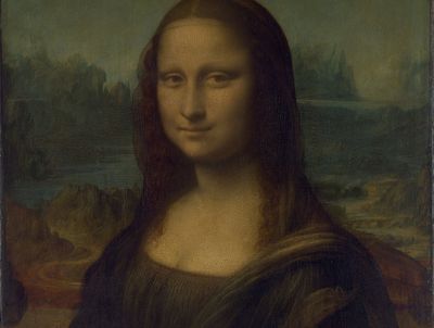

An interface needs that rule, warm forward and cool back, all the time. A screen usually has a few things that should lead, more that support them, and chrome that should stay out of the way, and the differences between them are often too fine for size or weight alone. Handling hierarchy across all those cases takes temperature as a dial the system can turn without disturbing anything else. Three ramps on one lightness scale are that dial, and building them was a chance to work the way the masters did.
Two new tokens put it to work. --color-bg-forward is warm, for the one thing a screen should lead with. --color-bg-recede is cool, for chrome that should step back. Each keeps the lightness of the surface it replaces, so text contrast holds. (The one exception is dark-mode recede, which steps a little darker, since dark surfaces are already cool.)
The warm paper tone from the code-block experiment has a home in the system now: --gray-warm-25, the forward surface in light mode, is a warm neutral of the kind it was missing. The code blocks themselves went a different way, to a quiet teal tint.
One accessibility rule governs both tokens: temperature guides the eye and never carries meaning by itself. A warm card can say "start here," but it cannot be the only way a page says "this is an error." Anyone who cannot perceive the difference loses only emphasis, never information.
What Changed Around the Greys
The new ramps let me make a few other decisions. The light page is now a cool off-white, --gray-cool-25, matching the undertone of the dark theme. Raised surfaces such as dialogs and menus stay pure white, so they lift slightly off the page.
Text is neutral in both themes. With the page carrying the temperature, text no longer needs to, and hierarchy can be pushed warmer or cooler from a neutral starting point.
The tinted page cost some contrast. Candor's contrast audit re-checks every recorded figure against the current values, and it re-measured forty-seven. Most fell by 0.2 to 0.5, and the lowest, subtle text, sits at 4.8 against a floor of 4.5. My first pass broke two control borders on dark raised surfaces (2.9 against a floor of 3.0), so I moved step 800 to a lightness of 0.30.
What It Means for Anyone Using Candor
Semantic token names did not change. A component styled with --color-text-subtle or --color-bg-surface picks up the new values with no edits.
Grey primitive names did change meaning. Eight 5.x names now resolve to a different colour, six of them to a different lightness: --gray-700 was a lightness of 0.32 and is now 0.40, for example. Anyone who referenced a primitive directly should check the migration table in Candor's breaking-changes notes, which maps each old name to the step that holds its colour now. The before-and-after story shows the same mapping with swatches, read straight from the token source.
Lessons
A set of correct values is not yet a system. Every old grey passed its audit. What the set lacked was a rule a person could predict from, which is what lets the next decision be easy and consistent.
Let a curve hold the eye's calls. A designer's eye is still the judge of whether a ramp reads as one family. Fitting a curve to those judgements kept them and made the ramp easy to extend.
Give a perceptual property one job. Lightness carries contrast and temperature carries emphasis. Because the ramps keep the two independent, changing temperature barely moves contrast, and that is what makes the warm and cool ramps safe to use.
Leonardo da Vinci, The Notebooks of Leonardo da Vinci, vol. 1, trans. Jean Paul Richter (1888), §295, "Of Aerial Perspective": "Those you wish should look farthest away you must make proportionately bluer; thus, if one is to be five times as distant, make it five times bluer." Available from Project Gutenberg. ↩︎
Musée du Louvre, La Joconde : dossier documentaire, p. 4. The Louvre describes the landscape in two parts: below, paths and a bridge "dans une palette chaude d'ocre roux" (in a warm palette of russet ochre); above, "un paysage bleuté" (a bluish landscape) of jagged mountains. ↩︎