Executive Summary
My blog failed its own dark-mode WCAG contrast audit: two link colors scored 2.2 and 1.6 against a 4.5 threshold. Rather than patching the hex values, I treated it as an accessibility architecture problem — I built Candor, a design system grounded in OKLCH color science and humanist typography, and migrated the blog onto it. The migration produced a passing audit and documented reasoning behind every token choice. A separate DOM-level accessibility audit surfaced six assistive-technology issues the contrast tool couldn't see. The numbers, the rebuild, and the repos are all documented here.
Introduction
This blog largely exists to argue that accessibility compliance without outcomes is insufficient. When my own blog failed its dark-mode contrast audit, the failure wasn't just a color value — it was a credibility problem. The blog had never had a design system, just a collection of independently chosen values with no principled relationship to each other. Building one gave me somewhere to put the reasoning, not just the values — and that's what made the overhead worth it even for a one-person project.
The Audit
The blog existed before the design did. I started writing and built the minimum scaffolding needed to publish: a template, some CSS, a deploy script. The visual treatment was functional in the way that unexamined defaults are functional—it worked until someone looked closely.
The contrast audit was the close look. Running an OKCA audit on the dark-mode configuration produced two failures that weren't close calls:
| Pair | OKCA | Threshold | Result |
|---|---|---|---|
Link (#1493fb) on dark background |
2.2 | 4.5 | Fail |
Link-active (#6969f7) on dark background |
1.6 | 4.5 | Fail |
A 1.6 score is not a borderline failure. OKCA's chroma compression makes mid-blue failures particularly pronounced—#1493fb reads as visually bright but carries low luminance contrast against a dark surface. Because OKCA has a no-false-passes guarantee, it's sufficient on its own: anything that clears it is safe, and WCAG's luma-only formula can come out of the loop.
The practical effect: posts regularly contain inline citations and external links. Readers using dark mode couldn't reliably distinguish those links from body text.
Why a Design System and Not a CSS Patch
The reasoning lives in token names. --color-link says what a color is for, not what it is — so when dark mode needs a different value, there is one place to change it, with the color relationships already worked out. A CSS patch would have closed the audit without leaving any of that behind. This is the difference between an accessibility patch and accessibility architecture — the patch closes the finding, the architecture closes every future finding of the same class.
Why Candor
Using Candor — my own design system — wasn't a neutral evaluation. It was an opportunity to put the system into production on a real project and verify that the accessibility claims held up under audit.
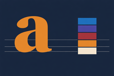
OKLCH makes accessible pairs tractable. The five color families—navy, burgundy, azure, purple, gray—sit on perceptually uniform lightness values, so a step-5 color in one family reads at roughly the same visual weight as a step-5 in another, regardless of hue. Candor's tokens are audited against OKCA, not just WCAG. The dark-mode link token (--color-link: var(--azure-300)) scores 5.8 on the dark background — above the 4.5 threshold with margin. This is inclusive design at the color-token level — the system makes accessible pairs the default rather than leaving each decision to a human remembering to run an audit.
The typography stack is humanist by design. Most design systems treat typography as a scale. Candor treats it as a purpose question: which typeface serves this context? Roboto Flex for UI and display, Noto Serif for editorial prose, Atkinson Hyperlegible for high-stakes reading. The token names encode those choices rather than leaving them undocumented.
The Typography Stack in Practice
At 39px, Roboto Flex's display heading has tighter strokes and stronger character contrast than it would at 16px, because the font adjusts. This is natural typographic hierarchy without artificial weight jumps between sizes. The type scale follows a Major Third ratio (1.25), so each heading level reads at a predictably different visual weight.
Noto Serif carries the article body. That shift from UI sans-serif to humanist serif is itself a reading-mode signal. The letterforms are shaped for extended reading in a way a UI font isn't, and moving between them tells the reader they've crossed from navigation into content.
Atkinson Hyperlegible lands where readers make decisions — tags above a post title, the "EXECUTIVE SUMMARY" label. A user who misreads a tag or skips a navigation item because the text was hard to process has encountered a failure mode the rest of the design can't recover from. The font choice is doing accessibility work that color and size alone can't.
None of this required writing new rules for each typeface. The semantic token names made the mapping explicit: --font-family-display on post titles, --font-family-serif on article prose, --font-family-accessible on tags and exec-summary labels, --font-family-mono on code blocks.
The Dark Mode Migration
Candor's named values handle dark mode through prefers-color-scheme: dark automatically, with a data-theme attribute override when needed. The migration was adding the token import and mapping semantic names to elements—the dark mode logic came with it, along with color values that had been audited for both modes.
Only color tokens change between modes. Spacing, shape, and typography are invariant. Dark mode is a color adaptation, not a layout reconfiguration—and the architecture reflects that.
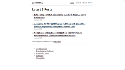
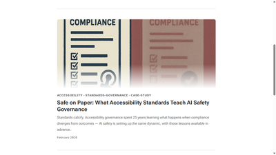
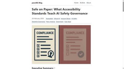
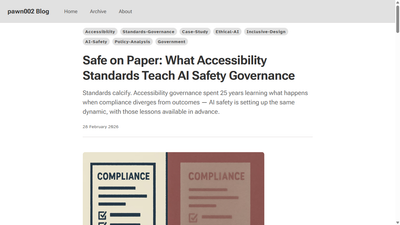
What the Screenshots Show
Home page
Post header
Dark mode link contrast
#1493fb scores 2.2 OKCA against the dark background, below the 4.5 passing threshold.
Screen Reader Audit
The contrast audit was a color audit. Screen reader accessibility is a parallel question that no contrast tool answers, so while migrating to Candor, I ran a separate accessibility audit on the DOM. Six issues had accumulated.
Post header DOM order. The h1 followed the tag list in source order—meaning screen readers encountered tags before the title, inverting the reading hierarchy. The fix moved h1 first in the DOM and restored the visual tag-above-title order through CSS order: -1. Visual and semantic hierarchy no longer conflicted.
Navigation landmark. A visually hidden h2 ("Navigation") announced itself to screen readers before every nav interaction. Replacing it with aria-label on the <nav> element achieved the same landmark labeling without the redundant heading.
Post listing articles. Individual post cards in the listing had no accessible label, making them indistinguishable to assistive technology. Each <article> element received an aria-label matching its post title.
Organizational disclaimer. A section that already had a visible heading was wrapped in a container with an identical hidden h2, producing duplicate announcements. The echo heading was removed.
Link text. "The archive" in body text became "the blog archive." The revised version works without surrounding context; the original assumed the reader already knew which archive.
Footer links. The footer link list received aria-label="Site links" to distinguish it from the article link structure surrounding it.
None of these show up in an automated contrast report. Finding them meant reading the DOM.
Lessons
OKCA replaces WCAG math, not supplements it. A 2.2 OKCA failure would have passed WCAG 2.1's luma-only formula. The no-false-passes guarantee makes OKCA sufficient on its own — running both is redundant.
Structural accessibility doesn't surface during visual design. The six screen reader issues were invisible at every stage of the design process. They required deliberate DOM-level review. Finishing the visual work doesn't start the semantic work — they're separate audits that have to be scheduled separately.
An accessibility blog that fails its own audit has a choice: patch quietly and move on, or publish what broke and what the fix looked like. Publishing is the option consistent with what the blog is for. The numbers, the screenshots, and the repos are here so the work is open to anyone who wants to check it.